This is article #20 out of 50 in The Startup Marketing Playbook.
Two ingredients are needed for a killer inbound marketing strategy fueled by content: writing and design. While in the early stages some startups outsource design, as you scale it becomes far more effective to have designers as an integral part of a B2B marketing team. Design is exceptionally important because marketers use it to:
Connect with a target persona
One of the first things you need to do in B2B marketing is define your personas: a detailed description of your target customer, outlining their demographics, behavior and preferences. The persona helps guide you on how to best interact with your target customers to motivate them to take desired actions, such as exploring your product. Design is a critical tool you can use to visually appeal to your persona. According to designer Kimi Yamamoto, “design shapes both the conscious and subconscious experience.” In other words, it has a tremendous impact on how a person feels.
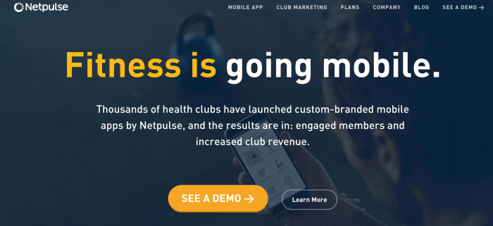
My team created an aesthetic for gym operators that is clean, simple to understand and toes the line between tech-y and masculine.
Communicate your story visually
Marketing ultimately comes down to telling a story. This story is the narrative used to describe what your product is, why it exists and how it helps your target persona. It is the foundation of your messaging and positioning. You communicate your story through your website, content (i.e. ebooks, webinars, blog posts), verbally at conferences and on sales calls. Effective design makes the story easy to understand. Design can make words leap off of a web page and articulate a concept in a digestible way for someone new to your story. Introducing new concepts is challenging, so design is one of your best tools for communicating it well.
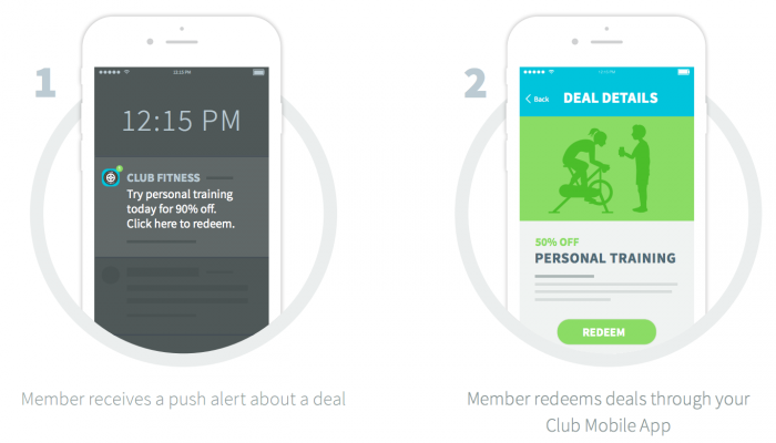
For my team, we make storyboards to illustrate how new features work. Since we are introducing technology that is very new in our industry, we break it down so that anyone can look at the collateral and understand how the product works at a high level.
Create trust in your brand
As a startup, almost no one knows who you are. Therefore, your name alone doesn’t carry much weight when targets are considering whether to read what you write or listen to what you say. Design can create early trust by making you look bigger and better than you actually are. Professional, sleek design in your marketing presence (e.g. website, collateral, content) is a must from the very beginning. It encourages people to download your content before they really know who you are. It encourages people to browse your website or click your ad on Facebook. According to designer Mark Melvin, “design demonstrates your level of effort and dedication in presenting content. It shows your targets that you are serious and that is what builds trust.” You can use design as a major driver to kickstart (and sustain) an inbound marketing program.
As you are assembling your design strategy, keep 4 guiding principles in mind:
1. Alignment
Your design strategy must align with your company objectives, culture and story. If you strive to avoid aggressive sales tactics and put extra care into the customer experience, your design should reflect that with a comforting, approachable aesthetic. Lyft is a great example of this with its pink mustache. On the contrary, their competitor Uber is typically known to be more aggressive, business-focused and sleek. Uber’s heavy use of black and grey in their color palette communicates that focus.

2. Continuity
As you define a design aesthetic for your content, it’s important that you document it and keep it consistent as you build. For example, my team uses illustrations to tell our story. All of our mobile app’s screenshots in our marketing material are illustrated, from the website to sales collateral. This style demonstrates how our product works in the easiest-to-understand way.
3. Variety
It’s important to note the difference between brand and content. While you may have specific brand guidelines for material with your name on it, your content is often designed to be unique and varied. After all, if you created ebooks and PDF guides that looked exactly the same each week, your inbound campaigns would likely perform poorly. The design team has flexibility when creating content and has the opportunity to experiment with different styles, as long as they align with the guidelines you established to appeal to your target persona and tell your story.
4. Clarity
Design should make messaging clear, simple and easy to understand. I’ve reiterated this a few times in this post because it is so important — your targets will not spend the time to understand your story if you don’t make it ridiculously easy for them to do so. Looking at fun visualizations is a heck of a lot better than reading a white paper. When you leverage design to communicate with clarity and disseminate your marketing messages, you’ll see:
- More content downloads
- Higher conversion rate on landing pages (trust)
- Increased website traffic
- Increased usage of collateral
- Greater virality and velocity of sharing content online
- Greater ability to squash sales objections with collateral and content
Bottom line: world-class marketing teams invest in design.


