This is article #46 out of 50 in The Startup Marketing Playbook.
For every piece of content in your inbound marketing strategy, there is a landing page hosting, displaying and providing the ability for targets to download. The landing page is a critical gateway to your content. Depending on design and copy, it will make or break the conversion from targets to leads, a crucial step in the marketing funnel. Therefore, you need to pay close attention to how you develop and optimize landing pages.
This post outlines some best practices in building and scaling landing pages for B2B startups:
1. Always use the marketing automation system
Landing pages are tightly integrated with other components of inbound marketing, controlled by the automation system. This includes CTAs, content distribution, lead capture and the automations that run when a target converts to a lead by downloading content. While it may be tempting to use a separate service specifically designed for landing pages, it’ll make your life so much easier to keep it all under one roof. I use Hubspot to handle everything.
2. Align the form right
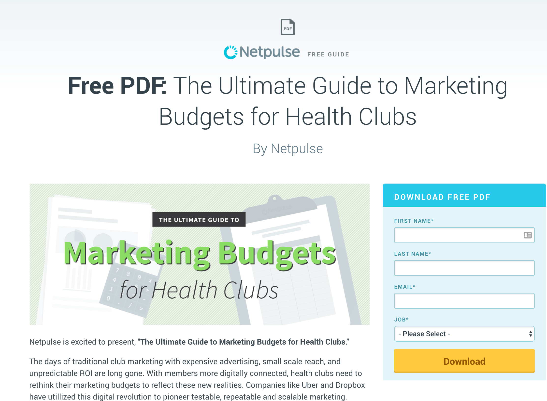
People read text left to right on a screen. I’ve found the best positioning for a landing page is the text/key value proposition on the left, immediately followed by the lead capture form on the right. Here is an example:
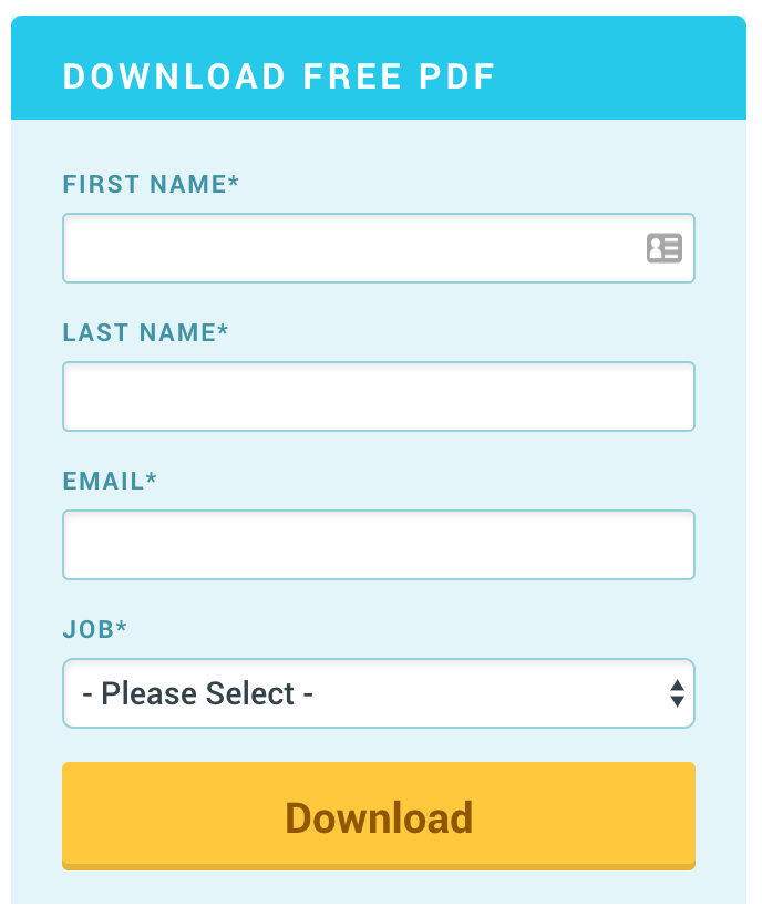
3. Make the submit button pop with the right colors
I stick with a big yellow button for “Download” in my landing pages. This ensures it clearly pops out and is the only element to click on the entire page. In most landing pages, you eliminate top and bottom website navigation, so the user cannot leave the page without closing the browser tab.
4. Ensure the content matches expectations
When a user clicks a CTA elsewhere on your website or a blog post, your credibility is on the line when they arrive on the landing page. You need to meet their expectations and not appear as though you did a bait and switch. This means that if they expected a guide about “marketing budgets for health clubs,” that better be the only offer that is highlighted on the landing page. If not, conversion will be in the gutter.
5. Clearly articulate what happens when “Submit” is clicked
Fake conversions give you no value. When a user submits a form, it should be very clear that they are “requesting a demo” or “downloading a PDF.” The action that happens upon submit should be aligned with the target’s expectations and be outlined in the text of the landing page. Each of my forms have a clear description at the top:
6. Avoid lengthy text
Landing page copy should be brief. Stick to a big title, one line subtitle, a couple of sentences and a bulleted list of what value the target gets by completing the form to get the content.
7. Limit the number of fields in the form
Remove any barriers to a target filling out the form. If you require them to provide tons of personal information in the lead capture form, they are going to abandon. The fewer fields required, the better. I try to stick to the absolute basics: first name, last name, email address, persona (displayed as job title). This is the minimum information we need to further engage that lead and get them into the right nurture workflow.
8. Make fields drop downs for easy reporting
Always strive to limit the amount of free text fields in your lead capture forms. By defining preset options in a drop down, you can easily report on results in dashboards and see valuable trends.